Herta Product page redesign
Herta is a brand known for products such as ham, sausages, dough, and ready-to-eat meals.
See it liveHerta — Client
FCINQ — Agency
Stéphane Villareal — Creative Director
Validation, feedback
Olga Havrysh — UX/UI Designer
Web site audit, benchmark, wireframes, UI design
Glen le Cuff — Graphic designer
Custom iconography
Frédéric Devaux — Full Stack Web Dev
Development
Alexis Le Squern — Project Manager
Project management
The objective of the redesign was simple: make the page easier to understand and more engaging to explore.
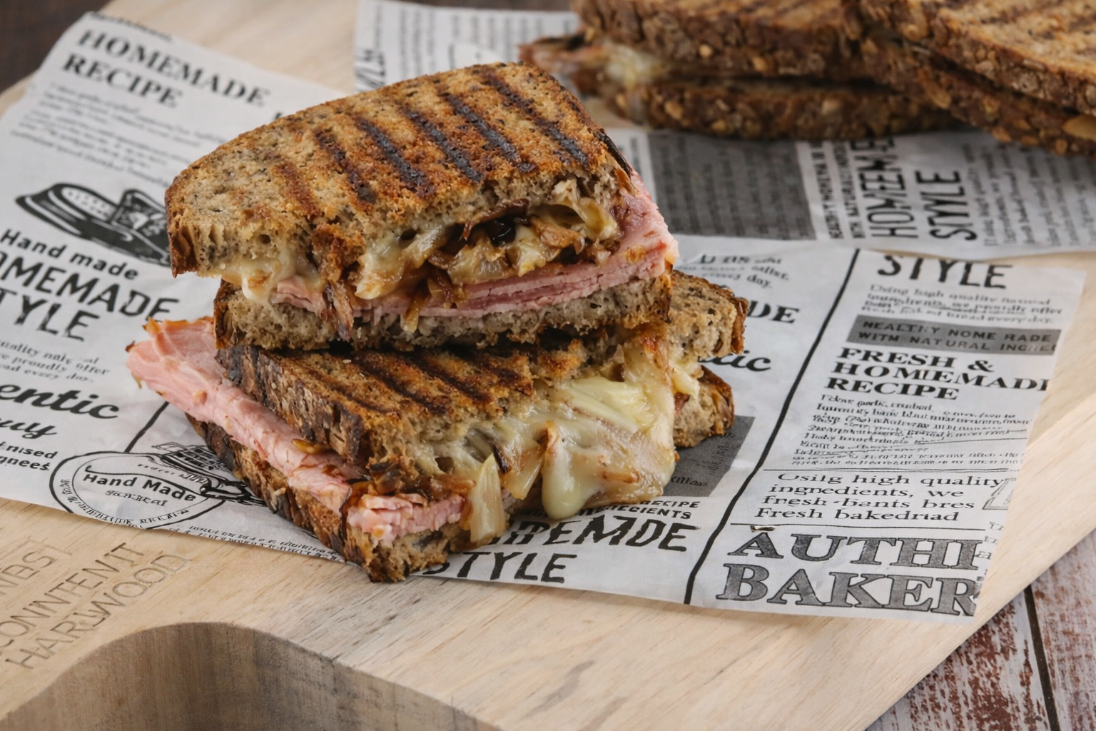
Before the redesign, the Herta product page felt crowded and difficult to scan. Ingredients, allergens, nutritional values, and recipe ideas were all present, but spread across the page without a clear hierarchy. The experience felt dense, outdated, and did not help users quickly find what they needed
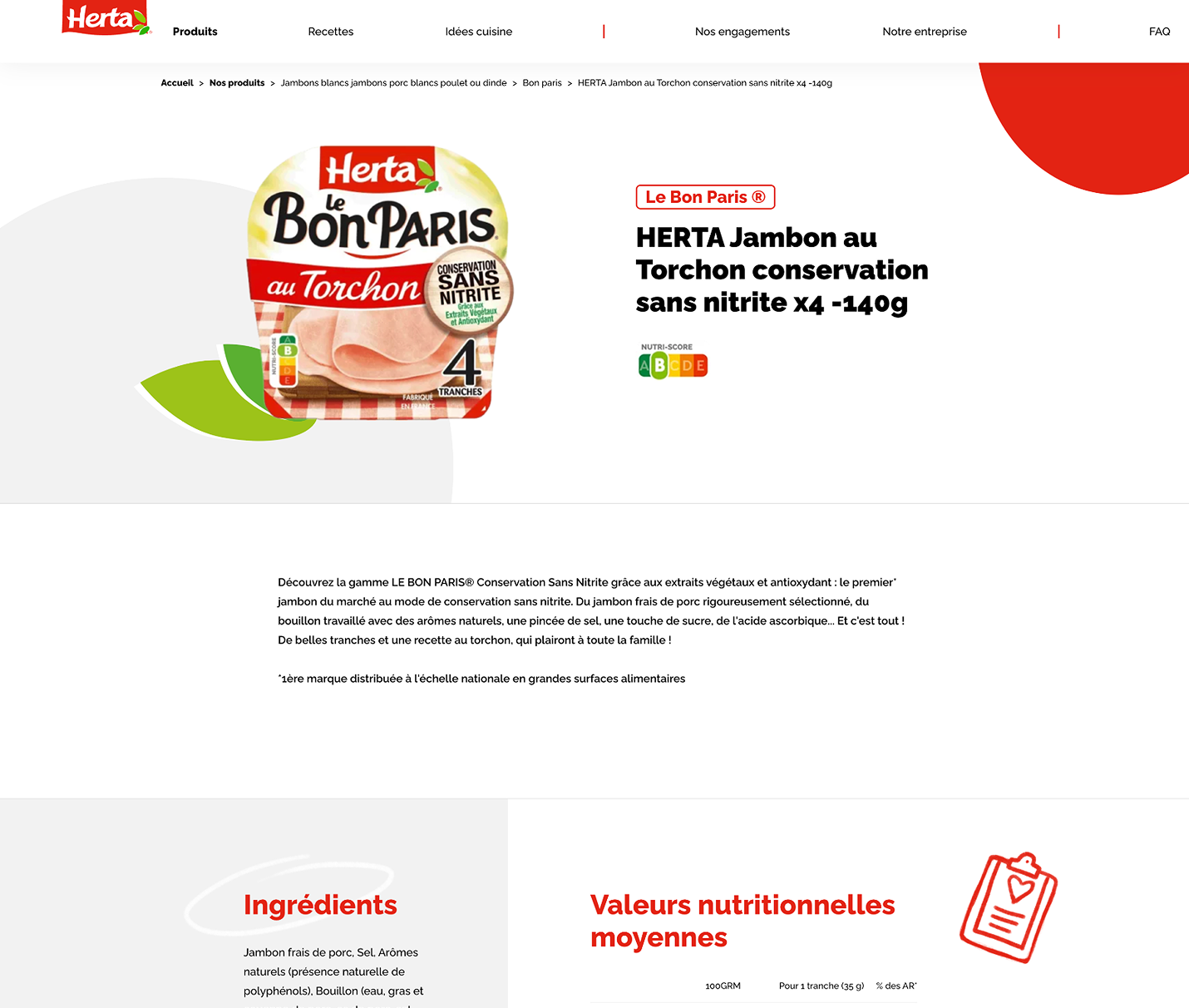
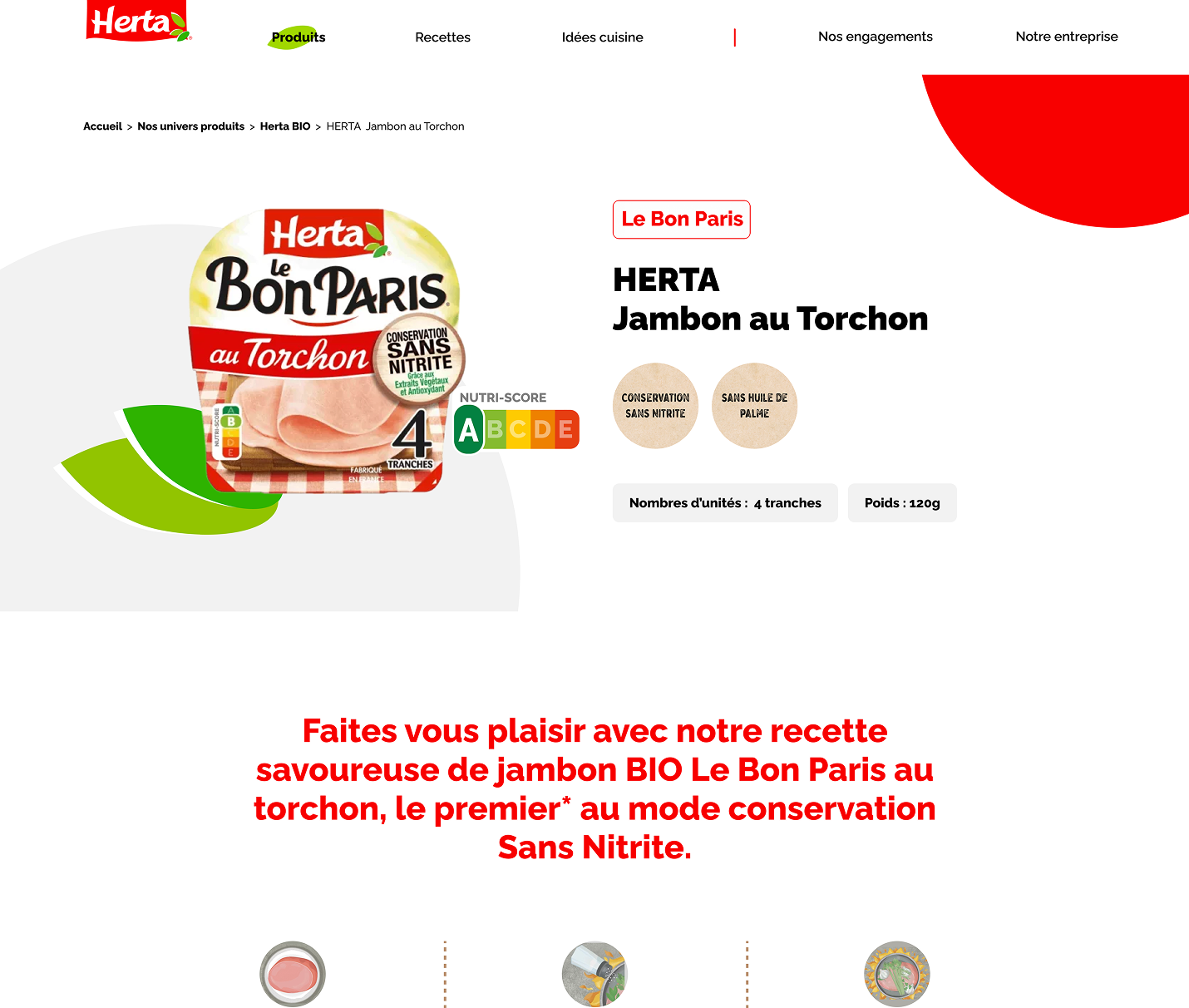
To redesign the experience, I first conducted a full audit of the Herta website to identify recurring issues and opportunities for improvement. I also benchmarked the experience against competitor websites and best practices to define a stronger content hierarchy. From there, I created wireframes to rethink the page structure, the order of information. The final UI was then designed using the existing design system to ensure consistency across the website.
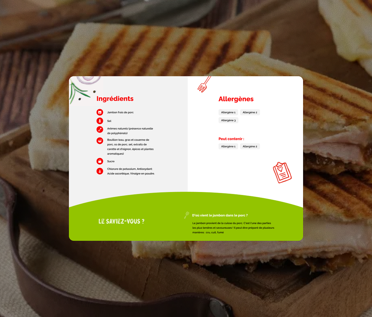
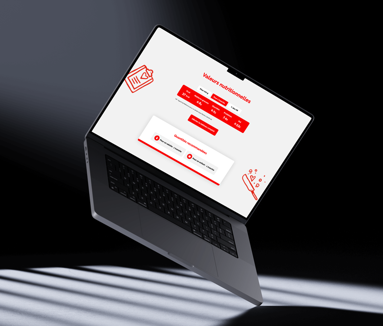
The new page gives more prominence to the product, improves readability. The result is a cleaner, more intuitive experience that feels more useful and engaging for users.


Want to work together?